Interpreting Retention Analysis Results
Retention analysis is a powerful way to evaluate how retention varies for different cohorts and segments of users throughout the user journey. Using this information, you can make data-driven decisions to improve the user experience, test the impact of product changes, and improve retention rates. For additional background, see Retention Analysis Overview.
In Loops, the results of this analysis are presented through a variety of easy-to-understand visualizations. This article will guide you through each of those visualizations.
Retention Curve
In the first visualization, a retention curve plots the average retention rate for all cohorts over the period of the analysis. The x-axis represents each bucket in the analysis (e.g. “Week 0”), and the y-axis represents the average retention rate. If you hover over each plot, you can view the exact retention rate and confidence interval.
Here’s an example of how it might look:

As you look at this curve, keep in mind that retention is determined by how many users who performed a retention activity during the period of each bucket – without consideration of the previous month’s bucket. (See What is retention?)
Also, you can segment this data by using the “Group By” parameter for your analysis. If you were to group the data by “Platform”, you would see multiple segmentation tabs at the top-right corner of the graph, as illustrated below:
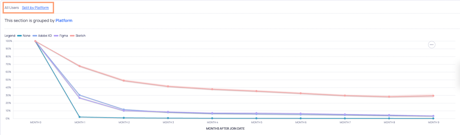
Upon clicking “Split by Platform”, you would see a different color-coded curve for each platform.
Cohort Breakdown
Located below the retention curve, this table provides a detailed breakdown of the retention rate for each cohort, for each bucket (a.k.a. period in the analysis). Here’s an example of how it might look:

Each row corresponds with a particular cohort (as defined by completion of the Starting Point), and each column corresponds with a particular bucket. Therefore, each cell represents the percentage of users in that cohort who were retained during the period of that bucket.
Keep in mind that each retention value is independent of the previous bucket’s value. Therefore, in the above example, 8.11% of the “16 Jan 23” cohort performed a retention activity during the “Week 3” bucket. In contrast, 9.75% of that cohort performed a retention activity during “Week 0”.
Note that you can also view these numbers as absolute values by using the toggle at the top-right corner of the table. Also, when you hover over any cell, you’ll see the alternative value (percentage or absolute value).
What is “Week 0”?
“Week 0” refers to the first week of user activity following a cohort’s Starting Point (e.g. when they joined your product). Therefore, when we say someone had “Week 0” retention, it means they carried out a retention activity during that period (a.k.a. bucket). It may also be “Day 0” or “Month 0” depending on how you set your bucket parameters.
Intuitively, you might assume that at “Week 0”, the retention rate would be 100%. However, this is not always the case, since a user who completes the Starting Point will not always perform a retention activity within the same bucket period.
Why do certain cells have an asterisk?
An asterisk appears next to a retention value when there is only partial data for a particular cohort/bucket combination. This means that not all users within the cohort had the benefit of the full period of the bucket to perform a retention activity. As a result, this value could increase in the future.
Why is this sometimes the case? Let’s use the above Cohort Breakdown as an example. As you can see, retention data is partial for the “30 Jan 23” cohort during the “Week 8” bucket. This is because some of the users who joined the product between Jan 30 - Feb 6 did not have enough time to complete their 9th week of usage (since the End Date for the overall analysis was set to April 2).
Why are certain cells empty?
Similar to the issue of certain cells having partial data, other cells may have no data at all. This may occur when no cohort users experienced any part of the period of a bucket.
Again, let’s use the above Cohort Breakdown as an example. As you can see, there is no retention data for the “30 Jan 23” cohort during the “Week 9” bucket. This is because none of the users who joined the product between Jan 30 - Feb 6 had enough time to complete their 10th week of analysis (since the End Date for the overall analysis was set to April 2).
To better understand how cohorts and buckets are defined for an analysis, see How Cohorts and Buckets are Formulated.
Of course, cells can also be empty when a cohort is empty – meaning that no users reached the Starting Point (e.g. joined your product) during that cohort period.
Retention Over Time
This curve is essentially a visualization of the above Cohort Breakdown. Its primary goal is to show how retention changes for each cohort over the period of the analysis (that is, across buckets).
The x-axis represents each cohort in the analysis, the y-axis represents the retention rate, and each bucket is represented by a color-coded curve. Here’s an example of how it might look:
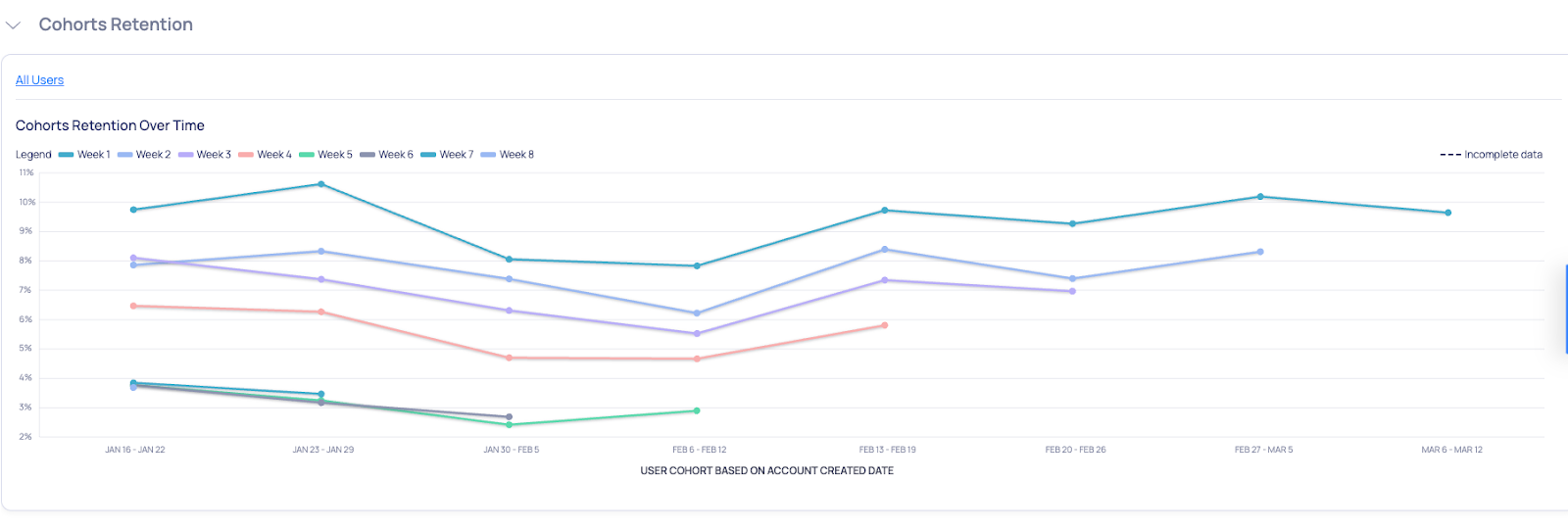
This graph allows you to detect trends in retention rates, and may be used for a variety of purposes. For example, you may
- Analyze how “Week 2” retention changes over time (i.e. for different cohorts).
- Evaluate whether “Day 1” retention is impacted by a feature you released in the onboarding flow.
- Discover that “Week 1” retention spiked starting from a particular cohort, and remained persistently higher thereafter.
Same as with the Retention Curve visualization, you can segment this data by using the “Group By” parameter in your analysis. Doing so will generate multiple segmentation tabs at the top-right corner of the graph (next to “All Users”). And by clicking each tab, you can see a different set of curves per bucket.

Segment Behavior
In this final visualization, you can analyze retention on a more granular level – on the basis of user segments. This primarily helps you achieve three things:
- Measure retention for each segment in your user base
- See how those values compare to the total population.
- Understand how those values vary across each bucket.
Here’s an example of how it might look:

At the top-left corner of the table, you will select which bucket to analyze. Then you can evaluate each cohort based on the following criteria
- Share of users: indicates the percentage of the total population that’s included in that segment.
- Retention: indicates the average retention rate for that segment.
- Direction: indicates whether retention is increasing or decreasing for that segment over time. The exact value reflects the slope of a linear regression model that’s fitted to the segment data.
- Change: compares the segment’s retention rate to the average of all other segments (excluding the current one).
So, using the above table as an example, here’s how you would interpret Week 1 data for the segment labeled “Device platform > Macintosh”. This segment accounts for 25.54% of the total population, and had a 51.24% retention rate during the “Week 1” bucket. This rate was a slight decrease over time, but in comparison to the rest of the population, the segment overperformed by 18.46%.